I just wrote a post about Live Query Statistics. Let me show you how this technology in SQL Server 2014 can be used for some amazingly cool (nerdy cool, at least) stuff.
Behind the scenes, LQS uses a DMV called sys.dm_exec_query_profiles. When you run a query with SET STATISTICS PROFILE ON, the engine puts data into this DMV for every operator in the plan that produces data (which doesn’t include the SELECT operator, or Compute Scalar, for example). What SSMS does while you’re watching a long-running query is poll this DMV over and over to get the progress data, so that you can see it in those moments between kicking off the query and its completion.
When you use LQS on a relatively quick query, say, one that completes in a single second, you can’t exactly watch this information come through. You might be able use a debugger, and pause operation of your server for a moment while you step through it, but this is far from ideal. And yet a query that completes in a single second might actually need some work. What if this query needs to be able to run many times per second, and you’re looking for strategies to tune every last bit out of it?
Clearly LQS is going to be no use.
But the workings behind it… that’s another matter. Let me show you.
When botanists are wanting to study what happens in the flight of an insect, they take lots of photographs, often using a strobe light to capture a moment with as little blur as possible. It allows for incredibly detailed images, like the ones you can see in this article from the Daily Mail in the UK.
(Image only linked from source – please let me know if it’s not there, but also go and look at the amazing pictures that this guy takes)
I don’t know how many times this insect flapped its wings between each image that was captured, but I think you’ll agree that with enough images, it would be possible to learn a lot about the way that the wing-flapping takes place.
This is the same as what I’m doing with queries in SQL Server 2014.
Suppose I run a query over and over, with statistics profile turned on. The code here runs my sub-second query over and over for six minutes.
|
1 2 3 4 5 6 7 8 9 10 11 12 13 14 |
--set statistics profile on declare @t datetime = dateadd(minute,6,getdate()); while (@t > getdate()) begin select p.Name, sum(d.OrderQty) as Qty from Sales.SalesOrderDetail d join Production.Product p on p.ProductID = d.ProductID group by p.Name; end |
I used an SSMS window for this, and told SSMS to discard the results. I only need to run it once to see the results – I just care about the profile stats. Incidentally, it returns 266 rows.
Now, I know that the plan that’s being used here is:

The Node_IDs of these operators are 1 (the Join), 2 (the Aggregate), 3 (the Scan on SalesOrderDetail), and 7 (the Scan on Product). These numbers have gaps just because of the inner workings of the Query Optimizer. And they go from left to right because that’s how a plan runs. The SELECT calls Node 1, which calls Nodes 2 and 7, and Node 2 calls Node 3.
So during five of the six minutes that my query was running over and over and over, I went into a different window and polled the DMV every half a second.
|
1 2 3 4 5 6 7 8 9 10 11 12 13 14 15 |
set nocount on go declare @t datetime = dateadd(minute,5,getdate()); while (@t > getdate()) begin insert dbo.rf_strobe select getdate() as myquerytime, *, 'Hash Match' from sys.dm_exec_query_profiles waitfor delay '0:00:00.5' end |
I had made a table which matched the DMV, with a couple of extra columns thrown in. One to record when I captured the moment (so that I could differentiate between moments), and one (called ‘comment’) to comment which query I was monitoring. The DMV contains the sql_handle and plan_handle, so I could’ve differentiated between them later, but I wanted to be able to differentiate between them more easily than that.
This data gave me 597 different values for ‘myquerytime’, 597 different moments captured. I don’t know how many different times my query ran in that time – probably far more than 597, although I wouldn’t have really cared if it were less. These 597 moments each had up to 4 rows, showing how each operator was going in its cycle.
There are columns in the DMV for all kinds of attributes, but the one that I was most interested in was the row_count, which tells me how many rows the operator has produced. There are columns about CPU, but as I’m looking at a query which runs in a small number of milliseconds, I’m more interested in the number of rows its produced.
Here’s a some of the data that’s in my table.
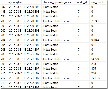
You can see that when I polled the DMV at 19:28:20.303, Node 3 (the Clustered Index Scan on SalesOrderDetail) had pushed 25241 rows, and no rows had been outputted by the other three. Half a second later, the snapshot showed 91044 rows from that node. Another half a second, and it was 54279, and in the poll at 19:28:21.807, the scan had served up all its rows, and there was output from the other three operators.
Each of these is like a strobe image, capturing a moment in the life of the query.
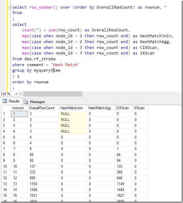
To recreate how the query runs, we need to piece them together. To do this, I’m going to assume that the outputted rows are done in the same order each time (which is a reasonable assumption when I’m running the query over and over in quick succession, with no changing parameters or conditions). By summing the row_count across all the operators in each poll, I can order the polls. A quick bit of pivotting…
|
1 2 3 4 5 6 7 8 9 10 11 12 13 14 15 |
select row_number() over (order by OverallRowCount) as rownum, * from ( select count(*) + sum(row_count) as OverallRowCount, max(case when node_id = 1 then row_count end) as HashMatchJoin, max(case when node_id = 2 then row_count end) as HashMatchAgg, max(case when node_id = 3 then row_count end) as CIXScan, max(case when node_id = 7 then row_count end) as IXScan from dbo.rf_strobe where comment = 'Hash Match' group by myquerytime ) s order by rownum ; |
…and I can see the query start:
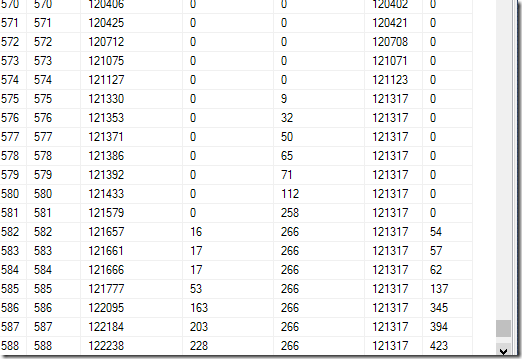
..and the moment when the Clustered Index Scan stops outputting more rows:
…and the end of the query.
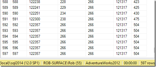
Notice that almost all the time we polled the DMV to see how the query was going, data was still being pulled out of SalesOrderDetail. It was only 96.1% (574/597) of the way into the query that data started to be outputted from the blocking Hash Aggregate. And because a Hash Match Join blocks until the hash table has been completed, we have to wait even longer before we eventually start pulling data from the Product table, when we pull up to 504 rows to find the 266 rows of interest.
I’m sure you can get a feel for how this query is running from this information.
But let’s compare this to what happens if I force a Nested Loop join instead of the Hash Match Join. This plan:

I repeated the collection of data, running the same query over and over but with OPTION (LOOP JOIN), and a different comment in the polled data. I also decided to use dynamic SQL to query my strobe table to save rewriting the pivot for each plan.
|
1 2 3 4 5 6 7 8 9 10 11 12 13 14 15 16 17 18 19 20 21 22 23 |
declare @comment varchar(100) = 'Forced Loop Join'; declare @qry nvarchar(max) = 'select row_number() over (order by OverallRowCount) as rownum, * from ( select count(*) + sum(row_count) as OverallRowCount ' + (select ', max(case when node_id = ' + cast(node_id as varchar(10)) + ' then row_count end) as [' + cast(node_id as varchar(10)) + ': ' + physical_operator_name + ']' from dbo.rf_strobe where comment = @comment group by node_id, physical_operator_name order by node_id for xml path(''),type).value('.','nvarchar(max)') + ' from dbo.rf_strobe where comment = @comment group by myquerytime ) s ' ; exec sp_executesql @qry, N'@comment varchar(100)', @comment = @comment; |
It started very similarly, but was very different towards the end.
The Scan seemed to go for a longer portion of the plan – 98.5% (587/596), but as the Hash Match Aggregate started producing rows, the Nested Loop was pulling the row from the Seek and returning it to the SELECT operator before pulling the next row in. You can see the row_count going up equally across the three operators, which is very different to what we saw with the Hash Match Join.
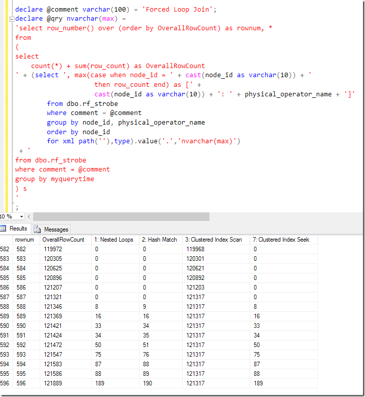
A factor I hadn’t considered before became evident at the end. In the Hash Match Join example, we saw a bunch of moments when all the rows had produced their data, which aren’t there in the Nested Loop example. The result of the query is no different, but the tear-down time is much quicker with the Nested Loop – presumably because the Hash Table used for the join doesn’t need to be dropped. I didn’t expect this to be as significant as it seems to be, but we certainly managed to catch six images – about 1% of them – when the operators had all stopped returning data, but the query was still hanging around as far as the DMV was concerned. With everything else being identical, I can only assume it’s down to the Hash Table having more to do to shut down than the Nested Loop.
Just for fun, I tested the pivot query itself, giving 582 strobe images.


The first thing to notice is that the Compute Scalar operators didn’t report anything, as expected.
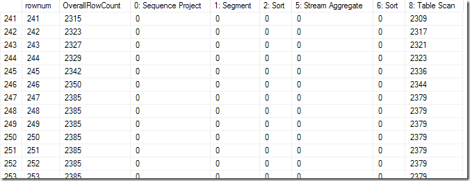
The next is that the right-most Sort was blocking, and had a significant pause after the Scan finished – about 35 rows or 6% of the query time.
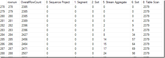
The Stream Aggregate doesn’t block, but the left-most Sort, which has called the Stream Aggregate (via two Compute Scalars) does, following which there’s another pause (but smaller – fewer rows), after which the Segment and Sequence Project operators don’t block.
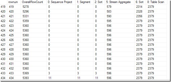
At the end of the query we have about 80 rows – well over 10% of the query time – after the Sequence Project has outputted its last row.
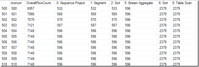

Now – there is more that I will learn about this still, and I have been making some assumptions about whether the DMV polling gives a sufficiently random moment. But from the things I’ve seen, there is definitely information about queries that I haven’t seen before and which require some further research.
Finally, I spent a bit of time looking at visualisation options for this. I immediately thought of the Power View play axis that’s on scatter charts, but sadly I didn’t have enough luck coming up with an effective visualisation very quickly. I had felt like Hans Rosling with his scatter chart about birth rates, and used LAG and MAX() OVER() to come up with a speed of row production compared to the total, but I kept getting the “representative sample” message, which wasn’t conducive. I’m sure it won’t be long before this visualisation would be easy, and for the purposes of analysis, I was more interested in exploring the data rather than making it look pretty.
Strobe photography is very impressive. I just never thought it would apply to T-SQL queries.

This Post Has 8 Comments
I love this post Rob,
The method reminds me of the methods used to generate this video https://www.youtube.com/watch?v=-fSqFWcb4rE because you’re sampling over several executions of a procedure and then assembling them (sortin them) to give a very fine-grained look at the behavior of the query execution.
You’ve basically taken something that’s too quick and slowed it down so that it can be inspected.
You mention this as a tool that can be used to tune every last bit out of a query. But I think more valuable is the insight into internals it gives to DBAs which helps more (even if it is indirect help).
Nice post Rob, puts a different spin on capturing and identifying what is happening. As you mention LQS at the start of the article and relating it to SQL Server 2014, I have a post that shows as long as you have 2014 SP1, running queries through SSMS 2016 LQS can be used to investigate your queries 🙂 http://www.sqlmastersconsulting.com.au/SQL-Server-Blog/sql-server-live-query-statistics-sql-2014
Cool. Like my one at http://sqlblog.com/blogs/rob_farley/archive/2015/08/31/live-query-statistics-in-sql-2014-not-just-sql-2016.aspx
Michael: Yes, I agree that what you can learn about queries from this is very useful. This can provide information for tuning, but also a greater understanding about internals in general.
Michael – and yes, that Ted talk shows a similar concept at an even faster rate. Sometimes I think academia would be so much fun…
Rob,
Cool stuff! Harold Edgerton (MIT prof who invented the strobe light – cool pictures – http://edgerton-digital-collections.org/galleries/iconic) would be proud of you.
Regarding visualizations, your description of the process and the interest in visualized progress made me think of SSIS workflows and observing the progress visually through color coding of SSIS workflow nodes (similar to query execution plan nodes – yes?) and # rows / % completed on active paths in the workflow graph. I don’t know if this is the best model, but it is a model already in place for other SQL Server tools, and that has had some success. Who knows if this approach and tooling might be adaptable by Microsoft for this new purpose, or lead to even better visualizations?
In SSIS, you are able to observe the progress in real-time (not sure of the sampling interval). For LQS, real-time may also be interesting, in addition to step by step replay of a captured LQS "trace".
Also very cool to hear that this type of query plan progress tracking is already possible in SQL 2014 as well as the upcoming SQL 2016.
Great work! Very enlightening.
Scott R.
Awesome ! very good analysis Rob .Yes it helps on understanding the internals .
Pingback: The tools in my day - LobsterPot Blogs